There are people out there who just love to dive into event data and numbers. And then there are the rest of us who are like, “Sheets of numbers, numbers, numbers…wait, what were we talking about?” If that’s you, you’re going to love this article on event data visualization.
Data visualization is a fancy term that simply means using charts and graphs to allow readers to quickly comprehend large amounts of complex data. Data visualization enables event managers to easily communicate trends, allowing decision-makers to quickly see and understand what is happening to inform strategy.
And strategy is crucial to a modern event professionals’ success. Audience expectations are more sophisticated than ever. They want engaging and personalized interactions, and demand convenience and ease of use.
To understand how to best visualize your event data, I talked to Allie Magyar, CEO of Hubb event content management system, and Brent Pearson, founder of InsightXM, which offers business intelligence and data visualization for event professionals. Here are their key insights into data points we should be capturing (but might not be) and which visual format works best to display that information.
The types of data insights event planners should be looking for fall into five major buckets:
1. New revenue opportunities: Show me the money!
2. Personas: This kind of demographic data informs you of who your customers or attendees are.
3. Spatial and temporal: For example, evaluating your events and attendees by location, or see event registration over time by location.
4. Behavioral/sentiment analysis: Here’s where you can delve into your customers’ feedback around given themes or topics, like which content topics they prefer.
5. Social analysis: Which online channels are your attendees using to communicate with you? Who are your top influencers?
When it comes to presenting your data in a visual way, here are a few common examples of data stories and the best visualizations to complement those insights:
Heat Maps
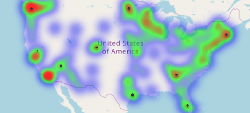 Where are my attendees? Use heat maps to show how many people are in different content sessions at different times to identify your strongest content. Heat maps show the relationship between two items, and can provide rating information using varying color saturation.
Column charts or bar graphs
How many registrations do I have this year compared to last? Or compared to the other events I coordinate? How do my registration numbers compare to industry standards? This horizontal set of columns can help avoid clutter as you display comparisons among different items or comparisons over time.
Pie charts
Let’s say you used several coupon codes during different phases of registration. Use a pie chart to show what percentage of your registrants took advantage of early bird ticket sales. Pie charts are great for showing static numbers and how categories represent the whole, represented in percentages.
Line graphs

If you want to review revenue week by week out from your event, or revenue from your events over a span of months or years, consider using a line graph. Line graphs show qualitative data patterns over time.
Data visualization’s purpose is to find the truths that lead to action. Luckily, with affordable tools available to event professionals today, you no longer need to employ an analyst and a graphic designer to include data visualization into your business presentation repertoire.
Raime Merriman is the strategic marketing director for Hubb, a cloud-based software solution that automates the complex workflows and tasks required to collect, manage and market content for conferences and meetings.