Marketing is key when hoping to drive attendees to your event. You’ve set up Facebook events. You’re tweeting regularly and the ticket sales are beginning to come in. So, it might be easy to overlook the non-digital promotion technique—posters. But done right, eye candy can draw people in to read the details.
There are plenty of templates and designs to choose from, with many companies offering them online. But perhaps it’s best to look to the past, when posters were at the forefront of event promotion, to see what worked best to drive sales and attendance.
1. Take the Text Out
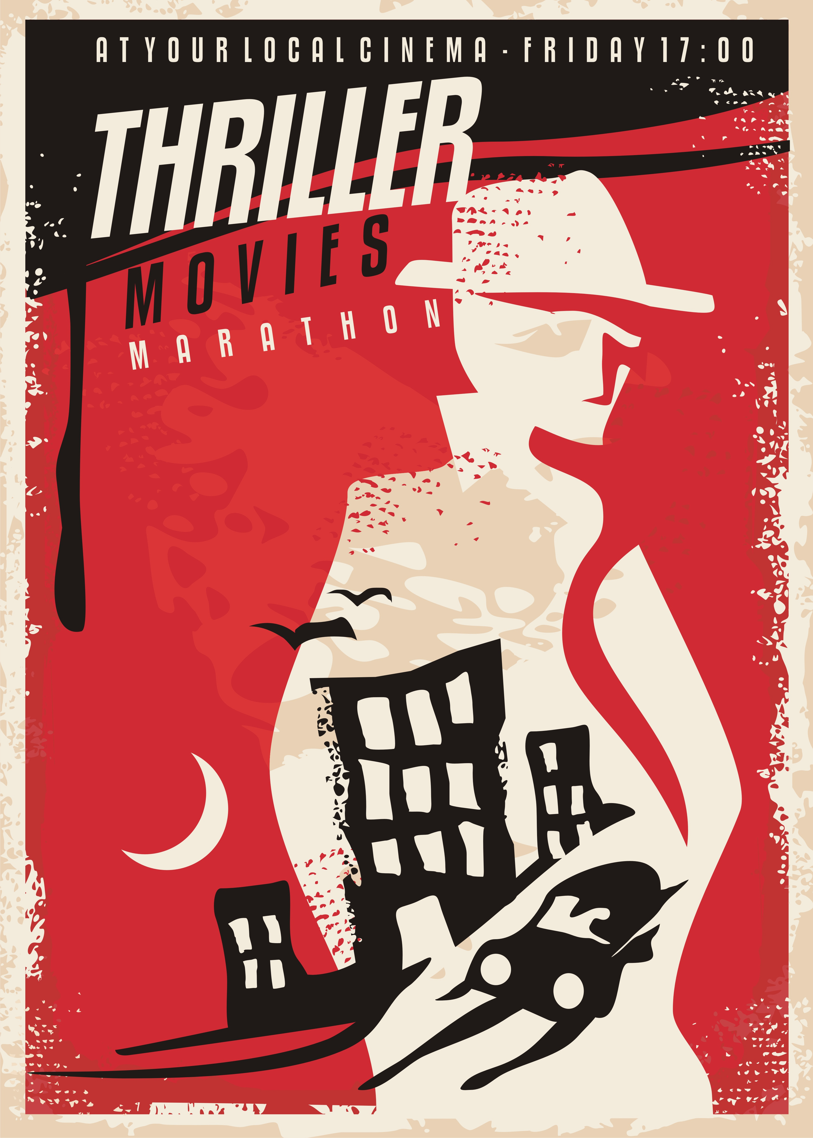
With social media and email campaigns filled with every minor detail, it’s easy to drown a poster in text. But visual calls to action don’t need to include everything. Boil wordy designs down to the basics, then add the website they can go to for more details. Clutter officially cut.
2. Title, Heading, Who, What, When
That’s the formula. Similar to the above, overwhelming amounts of information won’t excite people. So, use the title of the event, provide a short heading underscoring what the event is about and the details that matter most. Skip what type of food will be served to save space for the sizzle.
3. Make the Graphic Relevant
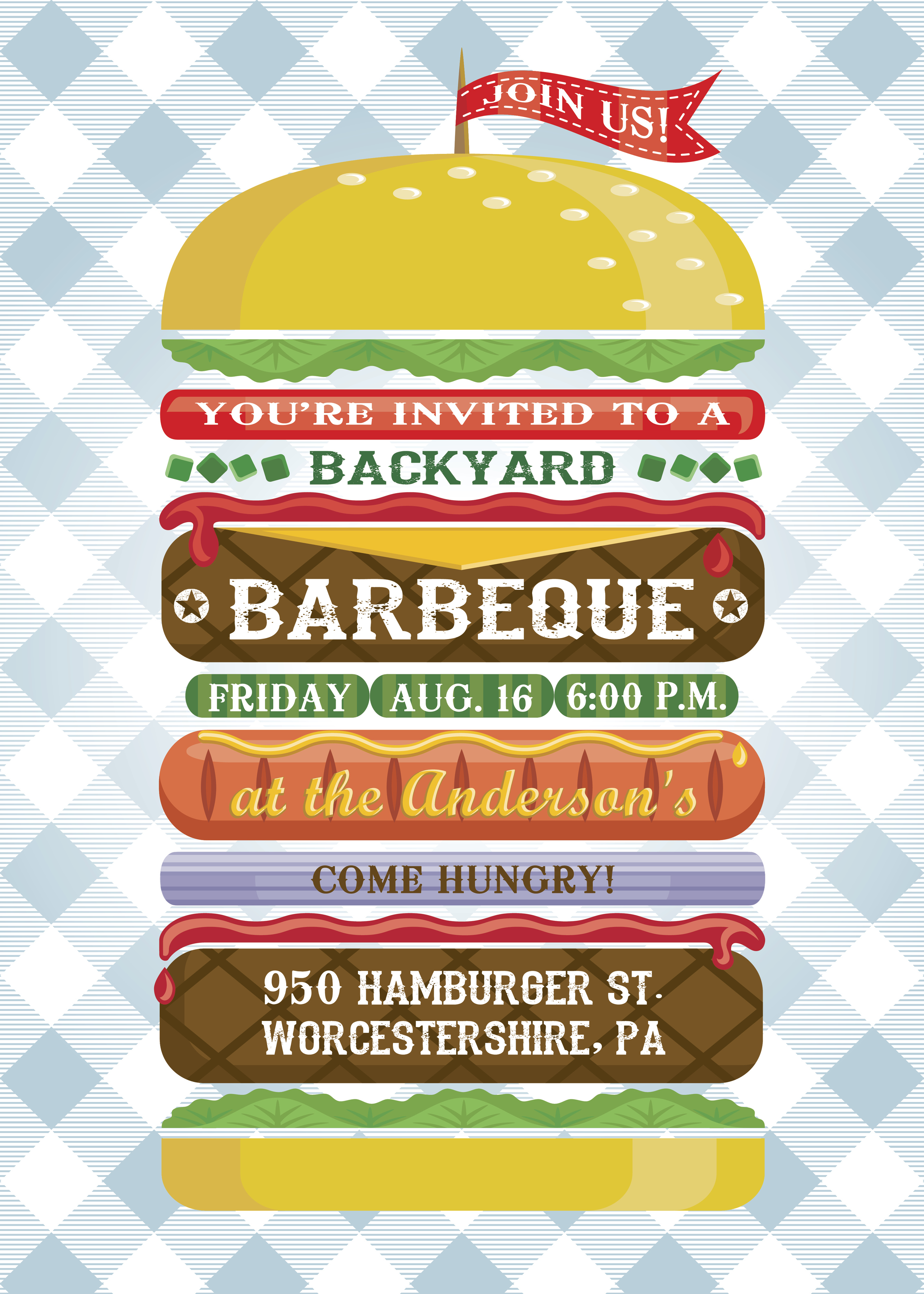
Is it a beach party? Add some sun and waves to your poster. A concert? Add some musical instruments. A barbecue? Place text in the layers of a burger. Basically, give your poster a theme. Once you’ve chosen that, consider how you’ll design the text to fit it, rather than the other way around.
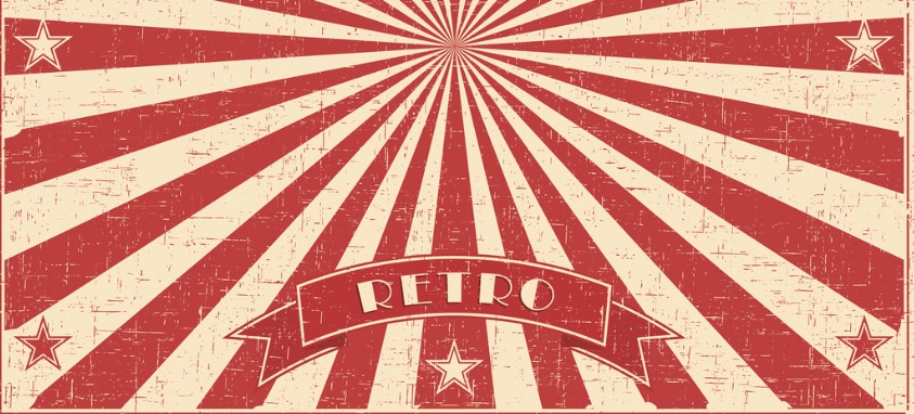
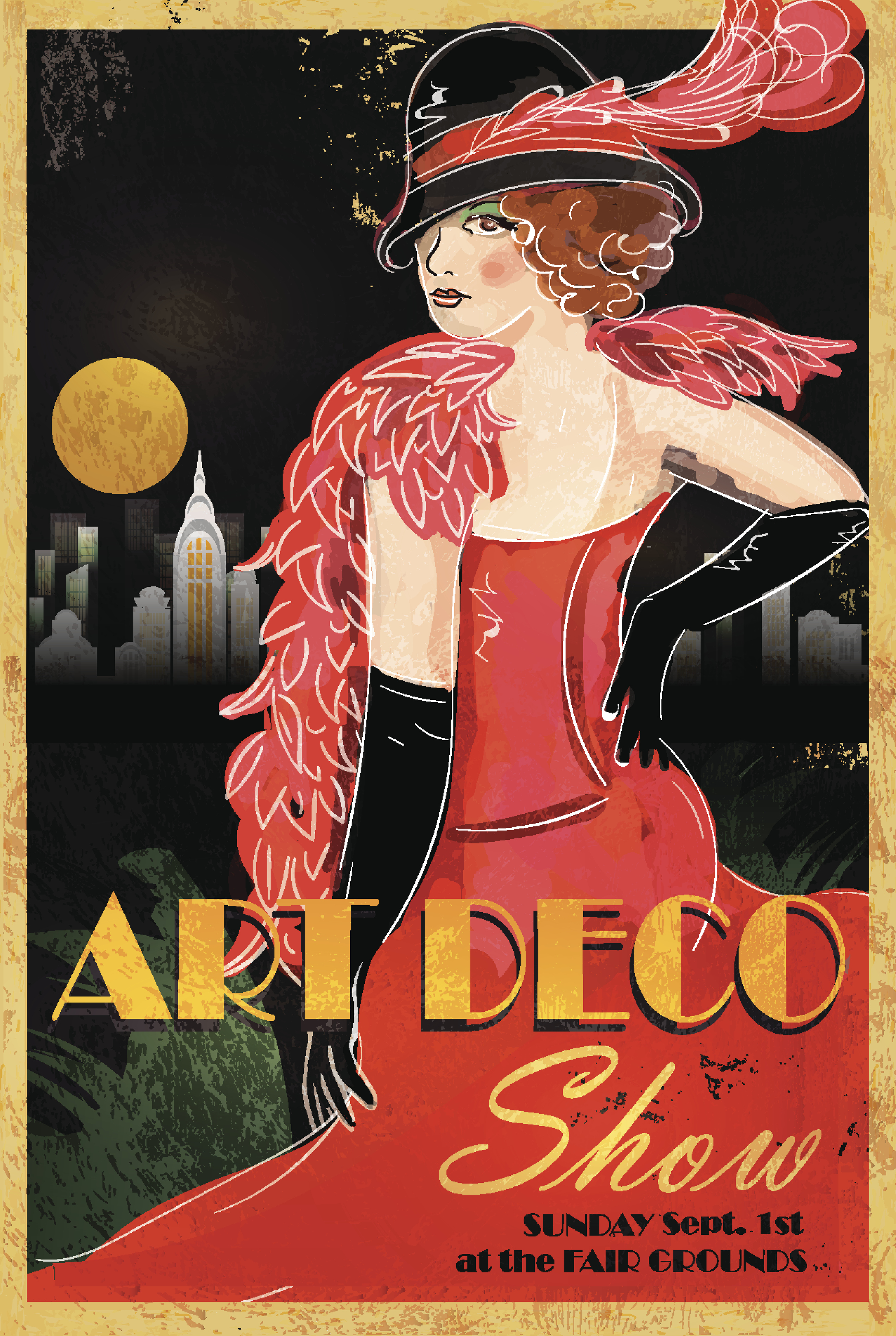
4. Color it In
Black and white is for newspapers. Vintage posters were bursting with color, and emulating them will give you the best results. You want potential attendees’ eyes to be drawn to the poster in the store window, rather than glossing over it. Bright colors and color contrast are important and more appealing to the eye.
5. Make it Big
Make the title one of the largest parts of the page. Ideally, the graphic—which is full of color, right?—will catch their attention, and they’ll be able to read your event name from six feet away. Font choice is also extremely important, and while some may look aesthetically pleasing, they may be impossible to read. Test out fonts and see if you can read them from across the room before making a concrete decision.