If there’s one thing the events industry doesn’t get enough of, it’s event design training. Event project management courses are abundant, and blog posts on event marketing can be easily found, but for whatever reason it isn’t easy to find high-quality resources on design principles for event planners.
When you think about it, that’s too bad, since the design of things like an event website, or the event registration experience, or even the banners displayed at an event, are the sort of things that define an event’s visual identity. In turn, that identity helps to shape how the event is perceived by attendees, speakers, sponsors and other key stakeholders.
In short, event design is far more important than planners might realize, so this article will introduce readers to three basic that can be used to make sound event design decisions.
Balance
One of the most fundamental principles of design is balance, this design principle is something that many can understand visually, thought it can be difficult to articulate since many different variables comprise a balanced design.
Essentially, a balanced design has the ability to impart a feeling of order. Since things feel as though they are “in place” and organized, the viewer tends to think that what’s happening behind the scenes is well organized. (Whether or not that’s true is another story).
Take a look at the image below, even though the objects are spaced symmetrically, the entire design feels out of balance because one side is colored differently.

Image Source DigitalTutors.com
The right side of the image above appears to be more dominant because of the bold shading. In contrast to this unbalanced design, take a look at the image below, this balanced design uses symmetrical shading, repetition and spacing to create a feeling of order.
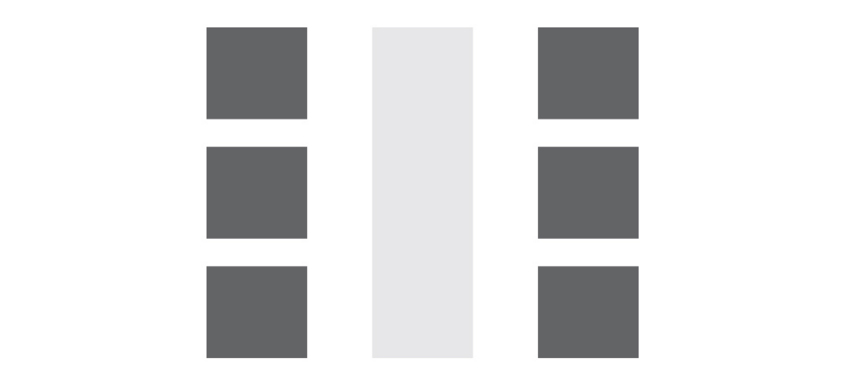
For event organizers who are organizing professional events, balance is a design concept they’ll want to master. It balanced design imparts a sense of order, and as a result, viewers feel as though the event is well run and professional.
Asymmetrical designs are not valueless, they make an excellent choice for event organizers who want to convey a sense of energy and creativity.
Color Psychology
Clearly there is a psychological relationship between mood and color. There’s a reason that sayings like “seeing red,” or “feeling blue” have real staying power in our vernacular.
Intuitively we associate certain colors with certain feelings, event planners devising a design theme for their events should be aware of the psychological impact color can have on audience members.
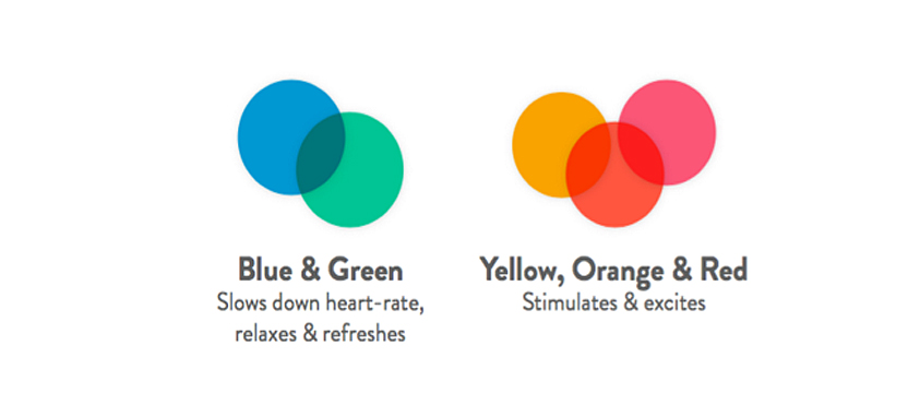
Image Source Bizzabo’s Event Design eBook
In the guide above, you can see that colors in the blue and green family tend to slow viewers’ heart rate, causing people to feel relaxed. In contrast, colors in the red, yellow and orange family stimulate and excite viewers.
Below, are a few examples of event logos that successfully make use of various color combinations, in addition to using the principles of balance and asymmetry to clearly convey the ethos of the event.
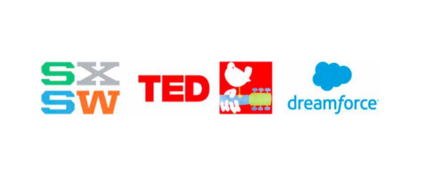
Image Source Bizzabo’s Event Design eBook
South By Southwest (left) uses a mix of refreshing and energizing colors to communicate the idea that the event is about exciting and refreshing new ideas.
TED (middle left) uses a bright red color to symbolize the energy behind innovation, and salesforce (right) uses a light blue color to communicate a sense of professional steadiness.
The 1969 Woodstock logo (middle right) uses Asymmetry to convey a sense of newness, and red to impart a feeling of vitality.
Typography
When you think about it, typography is a design element that we interact with quite a bit. From the type on an event website, to the promotional material shared on social media, to email materials, event apps and more, typography plays a pivotal if subtle role in shaping an event’s brand identity.
Merriam Webster defines typography as “: the style, arrangement, or appearance of printed letters on a page,” and event organizers have plenty of options when it comes to choosing a typographical theme.
Similar to choosing a set of colors for your event, organizers should choose typefaces the elicit the emotional feeling they are trying to convey to attendees.
Innovative events might want to stick with san serif typefaces as they typically look sleeker. Conversely, organizers planning more traditional events should stick with serif typefaces as they tend to feel more classical.
Above all else, event organizers must use typefaces consistently, it won’t do to have some serif and san serif typefaces haphazardly displayed on various digital and print materials.
Consistency is the key to using typography successfully.
Conclusion: Implementing An Event Design Strategy
Event design has the power to turn an average event into something that feels special, that is if it’s done well. By focusing on the basics, like creating balance or asymmetry (depending on the event), or selecting a series of colors that fits with your event mission, organizers can instill in attendees a deeper understanding of the event or conference.
Typography is also a key element to creating an event design that feels professional and consistent.
Event organizers should also know that these design principles impact things like the design of their event website, event space, and even event swag. Unfortunately design best practices for these assets is for another day, but readers can grab a comprehensive eBook on event design at the link in the meantime.
 David Epstein is the Content Marketing Manager at Bizzabo. Launched in July 2012, Bizzabo is the world’s first event success platform. It helps organizers create successful events by empowering them to build amazing websites, sell tickets, grow communities, go mobile and maximize event experiences – using a beautiful, user-friendly platform.